Executive summary
The CDC lied. People died.
The COVID vaccine had no benefits
It actually increased your risk of getting COVID. We know that from the Cleveland Clinic study.
It did nothing to reduce your risk of hospitalization. We know that from the data revealed in a study published in JAMA by a top epidemiologist at the VA.
The vaccine did absolutely nothing to reduce your risk of dying from COVID. I’m going to show you that below. It’s crystal clear. Rarely in science do you see anything that is this perfect.
In short, the COVID shots were all downside with no benefits. The vaccines and the vaccine mandates cost a lot of people their careers or their lives.
It was a massive con job by the FDA and CDC to make us believe that the vaccines worked when their own numbers show that it didn’t do a damn thing. In fact, I’d bet that they probably didn’t even look at their own numbers from CMS.
No upside, all downside.
My new analysis of the US nursing home data is undeniable
The US Nursing home COVID mortality data is gold standard per-facility data on the most vulnerable population for COVID. There is nothing in the world better than this dataset.
I’ve written about the US Nursing home data many times before (most recently in this article), but now I have a new way to present the data that shows the full story instantly:
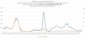
This is the only graph you need to see to prove that the COVID vaccine did nothing to reduce the risk of dying from COVID. The “gap” between cases and deaths did NOT change after the shots were rolled out. Some people say, “cases dropped” but as you can see, cases skyrocketed to new highs 12 month later. Also, we know from the Cleveland clinic study that the COVID vaccines increase your risk of getting COVID which explains why the height of the peak nearly doubled post-vaccine rollout.
What does it show? It shows the vaccines did NOTHING to reduce mortality. Zero. Zilch. Nada. It’s not even a close call. It’s OBVIOUS from just looking at one graph.
You can verify all this for yourself. I’ve created a dedicated github with the files and the code and the analysis spreadsheet with the graph below.
Here are the details…
The graph aggregates data from 15,058 nursing homes that is reported on a weekly basis. The blue lines (left axis) are cases. The orange lines (right) axes are SHIFTED deaths. The deaths were left shifted by applying a weighting factor of 0,.8,.2 to the death by week. This causes the death curve to align with the cases instead of being delayed. See the spreadsheet for details.
Secondly, I adjusted the scale of the right axis so that deaths would be scaled to match cases.
These two adjustments make it very easy to visualize the case fatality rate (CFR).
When the curves diverge is when you have a change in the CFR.
If the vaccines worked, we should have seen the curves start to diverge more and more from December 2020 through the end of March 2021 (see this article for the rollout curve), and then continue to diverge (at a slower pace) as more and more people were vaccinated.
But this didn’t happen.
You can see the curves are virtually right on top of each other (which is stunning) until the week ending 7/11/2021 is when we see the very start of a divergence but the divergence (gap between the curves) remains FLAT until Omicron hits. So this was not the vaccine “kicking in.” If that were the case, we’d see a rise over 3 months to maximum divergence and it would continue to diverge after that corresponding to the rollout of the COVID vaccine to nursing homes in the first few months of 2021.
The CFR drops precipitously a second time starting the week ending 12/26/21.
The post Official US Nursing Home Data Shows That the Covid Vaccines Did Nothing To Reduce Covid Mortality appeared first on LewRockwell.

0 comments on “Official US Nursing Home Data Shows That the Covid Vaccines Did Nothing To Reduce Covid Mortality” Add yours →